
the blog
A wedding vendor’s guide for all things copywriting.
What Is Copywriting? And How Does it Connect To Our Visuals?
Effective Copywriting – How to Connect Visuals with Copy for an Engaging Web Experience with Donata from The Good Canvas!
Today’s article is the first in a copywriting series and it’s focused on the impact that copy and visuals create together – that website magic!
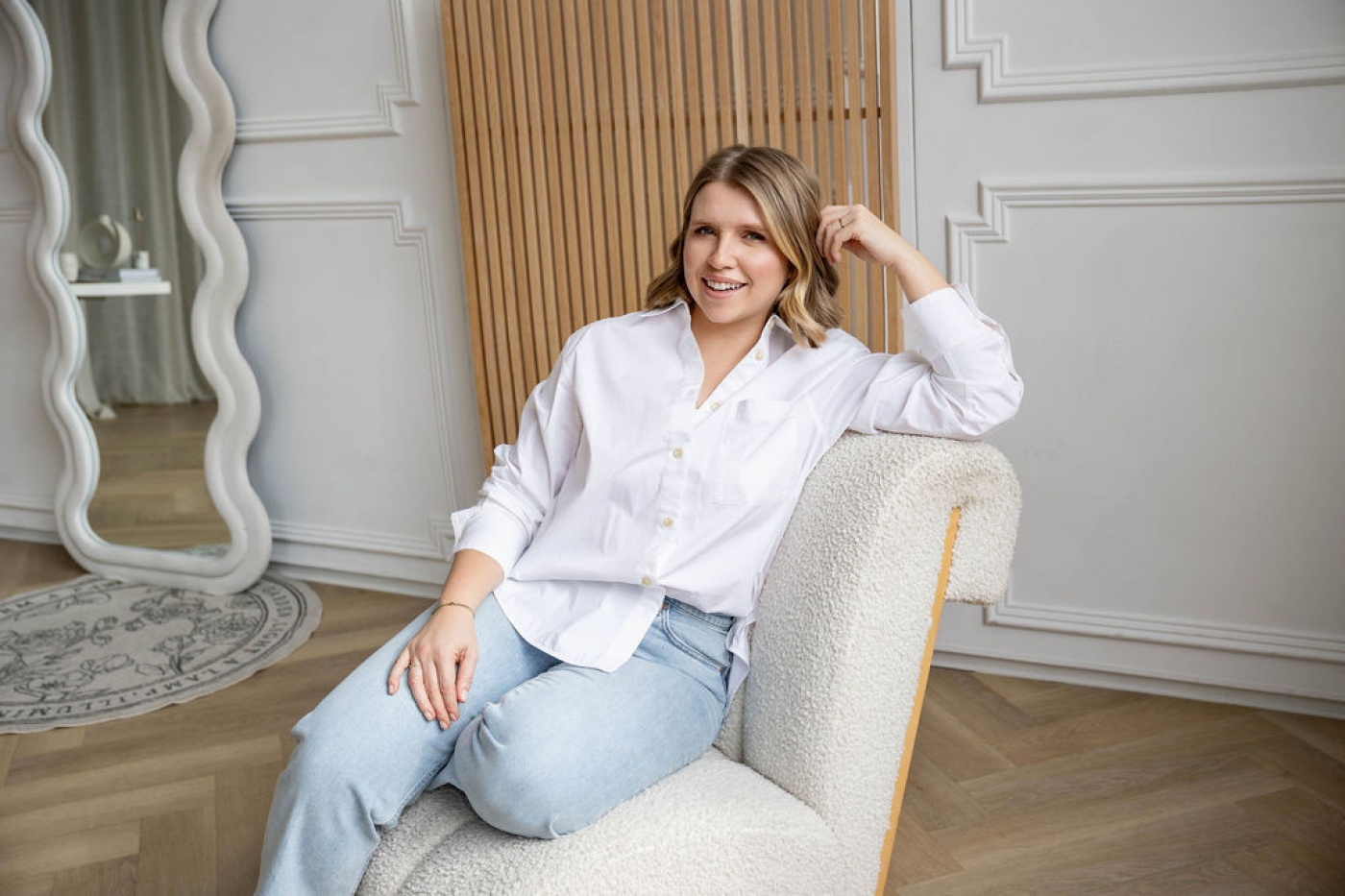
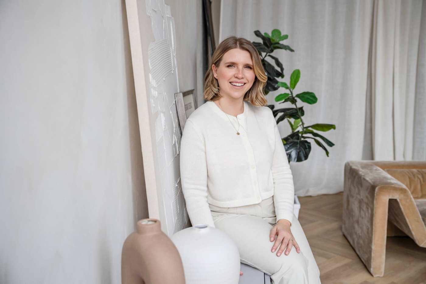
I’m Donata, Founder and CEO of The Good Canvas, an award-winning web design and branding studio that is focused on creating kind, purposeful and calm websites for creative entrepreneurs looking for reflection rather than noise. Joanna has kindly invited me to write a guest post so we’ve paired up to bring you a little mini-series that tackles one of the biggest challenges on any website – what to write, where to put it and how to pair it with visuals. When we experience a website, we’re not just reading words or looking at pictures – we’re absorbing a story. And the very best web pages create a rhythm, a natural flow where words and visuals work together to guide us, keep us engaged, and leave us with a feeling that resonates.
But when things feel disjointed – when website copywriting says one thing and the visuals say another—we can feel it immediately. Something is off. The message gets lost. The user experience feels overwhelming or, worse, forgettable.
So how do you bring content writing and visuals together in a way that feels seamless, intuitive, and strategic? It’s a bit of a puzzle, isn’t it? And while we’ll leave the copywriting to Joanna, we can help to pair copy with visuals in a way that feels seamless. Let’s take a closer look!
Let the Narrative Shape the Flow
Every page of your website tells a story. Whether it’s a long-form blog post, a service descriptions page or an about page, the opportunity for a narrative exists and it should shape how visuals and copy are used. The goal of copywriting is to guide the reader toward a specific action, and the right imagery can either reinforce that or create confusion.
Here’s a great place to start. Before adding any images, read through your copy. What emotion is it evoking? What tone is it setting? The images should reinforce that tone, not fight against it.
And then, and this is super important, what is the objective? Do you want your visitor to engage? Click through? Purchase? Leave a comment? The action is important, right? And the way in which you move your visitor through the page (or story) makes all the difference.
So, what would that look like?
Well, to start – the overall vibe. A brand that emphasizes trust and credibility might pair its content with professional, clean imagery and formal or elegant copy, while a playful social media ad might use bold colours, high-energy photos and casual, witty copy.
But, it’s not enough to just expect your visitor to read through and scroll all the way to the bottom. It’s actually highly unlikely unless you know how to guide them and keep them interested.
Use Visuals to Guide the Reader’s Eye
We don’t read web pages like we read books. Instead, we scan and jump around, looking for key takeaways. Images offer a moment to rest and absorb.
When you’re drafting or designing your page, pay attention to how your eyes move through the content. If this is hard to do for your own site, ask a friend to do the scan. Are the visuals pulling you towards the most important sections? Or are they creating distractions, making it hard to focus on the copy? What do you remember about that page a day or two later? Did it feel rushed? Forceful? Slow? What did it encourage you to do – click on the CTAs? Browse more? Close the tab? Was there a clear relationship between the text and the visuals?
Then, step back and look at your page as a whole. Does it feel like a smooth journey? Or does it feel cluttered and chaotic? Adjust by adding space where needed or breaking up long sections with intentional visuals.
Create a Sense of Rhythm (Fast vs. Slow Moments)
A well-designed page has a natural pace – some sections move quickly, while others encourage a pause. We love a good pause! Good web designers understand when to speed up or slow down based on the prospect’s intent.
What does this mean though?
- Fast moments = Short copy, punchy headlines, and bold imagery that create impact.
- Slow moments = Longer storytelling sections, softer visuals, soft animations or reveals and breathing room that invites reflection. Our happy place!
This applies to all types of content marketing – from blog articles to YouTube videos. The best solution is to balance persuasive copy with imagery that supports brand voice.
The Goal? A Website That Feels Effortless
When visuals and copy are in harmony, your website feels effortless to move through. The story unfolds naturally. The right messages stand out. And instead of feeling like a puzzle the visitor has to piece together, it feels like a journey they can simply experience.
So next time you’re working on content writing, whether it’s a blog post, email copywriting campaign or page update, ask yourself:
– Does this image support what’s being said?
– Is the flow smooth, or does something feel disjointed?
– Am I speeding up or slowing down the reader in the right places?
When copywriting and visuals work together, they create something greater than the sum of their parts.
The best part? We’re thrilled to feature this mini series of blog posts (this being the first!) that hone in on copywriting and visuals when designing a website.
If you enjoyed this post, you’re in luck! We’re going to share the next one in the series soon!
Web Design And The Good Canvas
If you’re looking to do a site update, refresh or build an entirely new website from scratch, we’d love to chat with you over a virtual coffee date. We help thoughtful brands align their website with their target customers and (re)build them a brand and website that is truly an asset to their business – beautiful, traffic boosting, high-converting and a place to build community! You can learn more here or book a free discovery chat.
How to Find Us:
Website: www.thegoodcanvas.com
Instagram: @thegoodcanvasdesigns
Pinterest: thegoodcanvasdesigns
See you at the next one!
Donata
